

Percona · 2024 · Brand Identity
Percona: Scaling New Heights
The problem
Percona had spent three years trying to rebrand with an outside agency. Concept after concept fell flat, the CEO was famously particular about the logo, and everyone was tired.
The solution
The answer came from noticing, not another round of concepts. This globally remote team built its annual trips around climbing mountains. Working on a conference in Colorado, inspired by the state flag, I saw it: a sun rising behind a mountain, forming the P. It finally felt like Percona.
My role: in-house Creative Director at Percona, leading the rebrand.
Overview:
Venturing into the established terrain of a 16-year-old startup like Percona felt akin to the onset of a challenging mountain climb. With its long standing logo, a vast content repository, and an aging website nearing obsolescence, the call for a brand metamorphosis was loud and clear.
New Percona Logo
Original Percona Logo
Challenge:
Percona had been trying to rebrand for three years with an outside agency when I joined the company. Concept after concept didn't resonate, the CEO was famously particular about the logo, and everyone was tired. But Percona had an intrinsic connection with mountains: a globally remote team whose annual company trips were built around climbing them. The parallel between a mountain's complexity and the database services they provided was hiding in plain sight.
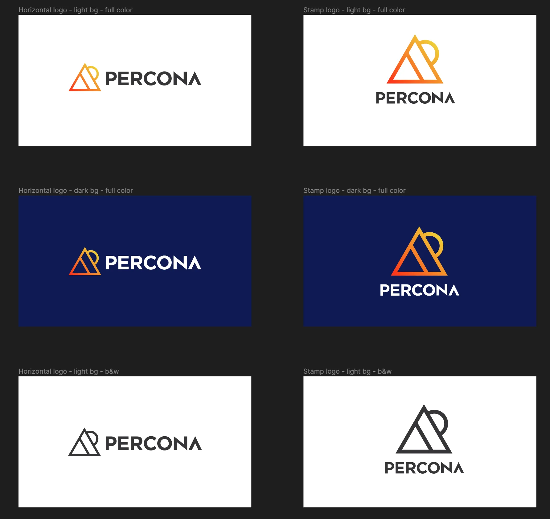
Solution:
The moment didn't come from a brainstorm. It came while I was working on a conference in Colorado, inspired by the state flag: a sun emerging from behind a mountain, uncannily forming a 'P'. This imagery was not only evocative but also symbolized attributes critical to databases:
Size and Volume: Much like the vast expanse of a mountain.
Depth and Layers: The numerous strata hidden within.
Stability and Reliability: A mountain's steadfastness through time.
Hierarchy and Structure: The organized layering of a mountain's composition.
Exploration and Retrieval: The act of climbing and discovering.
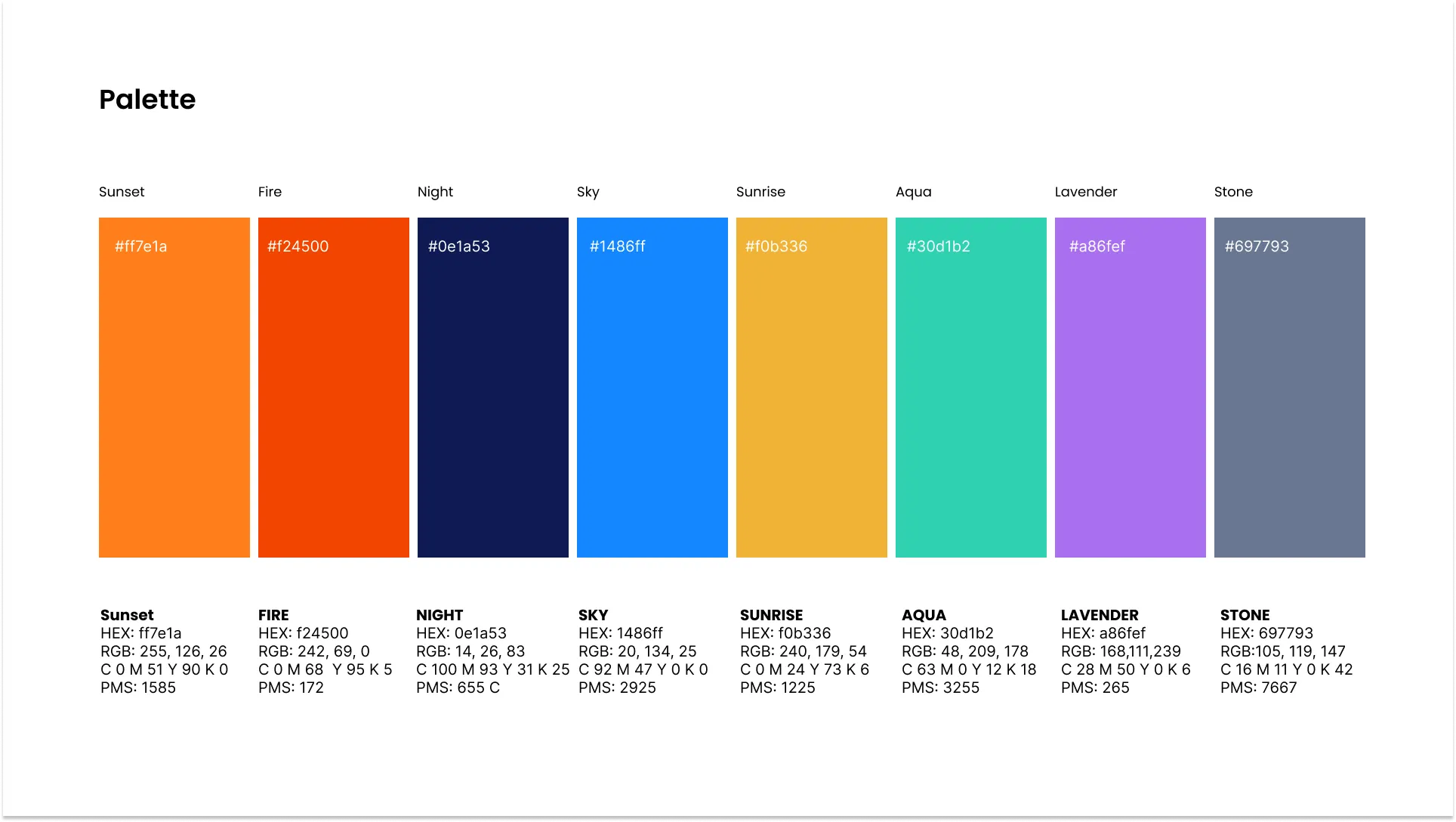
The logo was then born, breathing fresh life into Percona's identity. Building on this theme, a color palette inspired by earthy, natural tones was created. To ensure cohesion across the brand, we developed icons for all Percona products, marrying individual product symbols with the overarching mountain motif.
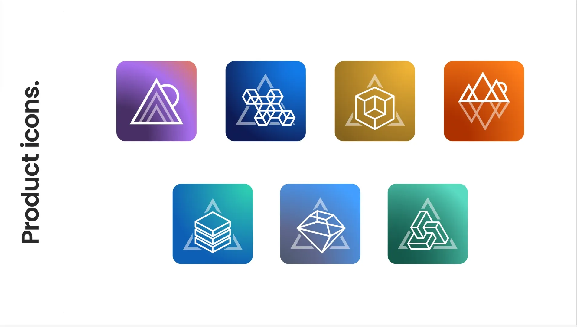
Outcome:
The revamped Percona brand now reflects not only its passion and culture but also aptly symbolizes the company's offerings in the database realm. The nature-inspired palette and motifs ensure a harmonious and relatable connection with the audience, reinforcing Percona's positioning in the market.
Logo + Product Icons - Lucas Spreyer , designer, Cindy Friedman , creative director
Brand Launch Video 2023 - Matt Kane , script, Kuki Bastos , animation, Cindy Friedman , creative direction
The brand outlived the website. Percona has redesigned its site since I left. The brand did not change: the mark I designed in 2023 is still the company's logo, and it still headlines Percona Live every year. Websites are fashion. A brand built on something true is the bones.
I tell the full story of this rebrand in "The Art of Noticing," my chapter in Luminaries.
More from this project